A Color Palette for Hornet

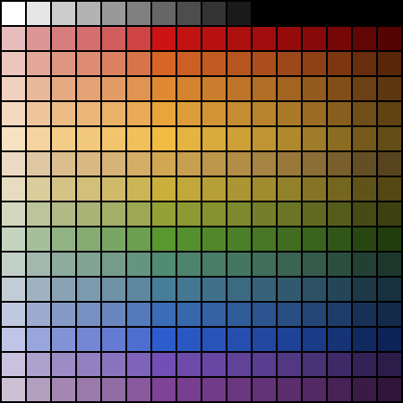
What a milestone. I now actually did game development in software rather than just pure concept work on paper. I created a color palette for the Hornet Engine.

While I want to go with an overall naturalistic look for both Kaendor and Iridium Moons, I also want it to be slightly stylized. The visual style that I have in my mind combines relatively low polygon models for characters and environments while maintaining realistic proportions and colors that are bold but not too striking. It's a style that I think can look very evocative while at the same time letting you get away with fairly crude models and animations. Like in impressionist paintings, the color and the light and shadow do all the heavy lifting, while shapes and outlines can be mere suggestions of the actual thing. I really like the look of Mike Mignola's Hellboy comics, and the 15 primary hues of this color palette are directly inspired by it.
It might look a bit cartoony any overly colorful for the kind of environments and creatures that make up my settings, but in the game all textures will be affected by shaders and environmental lighting. The color palette above shows the shades that textures would have under bright sunlight. And in those conditions, I do want the world to look very colorful, to create a strong emotional contrast to the misty swamps and dark caverns.
As one can see, I decided to drop one of the yellow-greens and replaced it with a more sand-colored hue. The greenish hue that took that position in the color wheel I created was particularly ugly and there's already two more hues of yellow-green. I also decided to throw out the magenta shade I had on my color wheel. While it was a nice hue, I just couldn't see myself using any of those shades for outfits or environmental objects. So I took that one off the palette as well and instead added a gray scale to make for a nice tidy 16x16 color grid.
Comments